Rigby Graham:
painter, printmaker and book illustrator
This is an edited extract from an interview entitled " Rigby Graham: Isolated Places as Inspiration", given to Julian Stribling by Rigby Graham which first appeared in the Book and Magazine Collector Magazine. I am most grateful to Julian for allowing me to reproduce it here.
Rigby Graham is a prolific artist: A painter, printmaker and book-illustrator, who has illustrated, and published, several hundred books since the late 1950s. His book illustrations include almost every graphic format; woodcuts, linocuts, lithographs, etchings, screen-prints and line drawings. This is matched by the diversity of his output, which ranges from single page broadsheets to lavish private press publications. He has run a variety of private Presses in Leicestershire, including the Orpheus Press (with Douglas Martin), Pandora Press (with Patricia Graham and Toni Savage), Brewhouse Press (with Trevor Hickman) and Cog Press. There are special collections of his work, including those in Manchester Metropolitan University and the University of Aberystwyth. His body of work is so vast, with some publications produced in such small numbers, that to assemble a complete collection would be almost impossible. This article is based on an interview with Rigby Graham and is an attempt to highlight some of his key publications, and to explore his influences and inspirations. His critical reflections on his own work provide an interesting perspective. This is not, however, an attempt to represent his entire corpus of work. For example, there is no mention of the broadsheets (see A Paper Snowstorm, by Derek Deadman & Rigby Graham, 2005). Nor is this a wider discussion about the influence of Rigby Graham in the Leicestershire private press movement (see Enthusiasm and Laughter by Derek Deadman, 2008).
Earliest influences
JS: What were your earliest influences in your printing or painting?
RG: I was influenced mainly by those artists who were quite well known when I was a student … the people who were known for English book illustration at that time, they all had an influence on me to a greater or lesser extent…I was trained as a painter, and specialised in mural painting and people have been surprised that I’ve gone from a mural that was say 500 square feet, as several of them that I did were. To go from something like that to a line block that was only 2 or 3 inches or the size of a postage stamp, or Christmas card…people thought that was surprising. But it wasn’t really; the problems are exactly the same. If you have a small rectangle or a great large wall, the problems are exactly the same. You organise a composition so that the thing fits together and reads well from the position it’s going to be used… in book illustration it’s usually seen 18 inches away from you, quite close. And you can take the whole thing in at one glance, whereas if you’re doing a mural and it’s up the stairway, or goes around a corner, you see it from a moving point of view, so the perspective can be a bit complicated….
Variety of printing methods used
The versatility and variety of Rigby Graham’s book illustrations are an important feature of
his work.
JS: You use a variety of media for printing – woodcuts, lithographs, linocuts and etchings
– which are you most comfortable with?
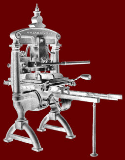
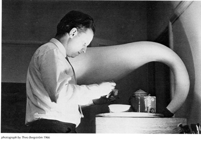
RG: Lithography, because I could draw the separations on paper or film, or zinc plate, or aluminium plates as they eventually became. Because there was no resistance, with your crayon or your brush, it flowed quite easily. Whereas, when you’re struggling with a woodcut, every bit you cut is hard going. You finish up with blisters on your fingers…[He continued by describing a large woodcut Santa Maria Della Salute –image size 77x60 cm] (that) was carved on oak and that was a nightmare to cut. Some wood is fairly soft to the touch, but oak is notoriously difficult to cut a straight line…Against the grain, it’s very, very difficult. The smaller the tool you’ve got, the easier it is, but of course it takes time. The black block for that, I remember took about 3 ½ weeks of solid cutting, morning, noon and night.
JS: The influence of work of the German expressionists, artists like Kirchner is evident in your work…
RG: Yes, Kirchner and all his pals, I was influenced, I was interested in them…and got no encouragement at all when I was an art student – they were beyond the pale, their work looked rough, and splintery and unfinished. It had the very quality that I liked, and admired.
Book illustrations as an art form
RG: What has always interested me, is the form of what an illustration does. Now, many book illustrators, they illustrate the book with eight drawings, because they’re told the book will have eight drawings. That’s eight drawings of kids skipping down the road or something…they follow the text. Well, I’ve never done any of that, no point trying to follow the text with some of these things. The more interesting ones, like James Joyce, you couldn’t really follow them sensibly... Pictures normally hang on a wall, or are painted on a wall. And can be moved, if a chap moves house, he takes his painting with him; he can hang it where he likes, or put it in the dustbin. Then there are illustrations, whether they’re original prints, or reproductions, or whatever… they are encased in a book. There are 12 illustrations, or 20, or 200, or in an expensive private press production, maybe 3 or 4. But they’re set in relation to on
another, and when you get to the third illustration, you see that in relation to the two that have gone before, and the four or five that are going to follow. Unless you rip the pages out, and destroy the book, you can’t alter that arrangement, the arrangement is set. So it’s a linear movement and also, the relationship between the way the picture illustration, and the way it’s done, is one of the places it’s seen at its best in relation to the type and the typography. Most people think the main job of the illustration is to illustrate the text, but that’s a bit insulting to explain visually what Shakespeare or Shelley, or Keats are writing about. Why should the illustrator think, or believe he knows best? Far better to use the contrast between the process or the technique of printing, or print making and a typographer has laid out an appropriate typeface, that either suits the text, or contrasts with it. And I found that, that quality, that whole idea of a thing encased; you open a book up and you suddenly see a castle, or a town, or a ship, comes as a surprise when you first see it. Comes as a surprise when you see it for the twentieth time, because you’re then beginning to see it in relation to the type you’re reading, the layout in relation to different processes, and the paper. The whole thing of book production is, I found a fascinating interest, and for me, it has something of the quality of a sketchbook. Because you open up a page, and draw on the recto, or on the verso, or both and you’ve got the adjunct of having endpapers to design to continue the theme, or to contrast with it. But the fact that they are anchored in a book, is important, it’s important in the same way that most early paintings, most medieval paintings, paintings from the twelfth century onwards, on vellum, and illuminated by monks in a scriptorium. If you go back in the history of painting, you can only go back 200 or 300 years. Most of the stained glass had been smashed by Cromwell or other iconoclasts; most of the paintings that were on a wall have either faded or been burnt, been discoloured, or re-painted or re-varnished and altered. But to open a medieval manuscript, which has remained closed, except for very few occasions when it’s been opened, you see medieval art as it was produced. You’ve got something of the same quality, although I’m not saying that Whitechappel [Iain Sinclair’s first novel with a frontispiece by RG] is the same as an Antiphonon in a monastry somewhere, but I think that there is the whole business of craftsmanship, fine materials, and the idea of a book being not only ideas that stem from the writing, but ideas that stem from the whole visual and tactile element. When you read a book, you notice the grain of the paper going the wrong way, or won’t stay flat, that side I’ve always found important. But again, when I explain that to people, I’m just wasting my time. They tell me that books are made to be read, well that’s only one function.
|
|
|